My working process

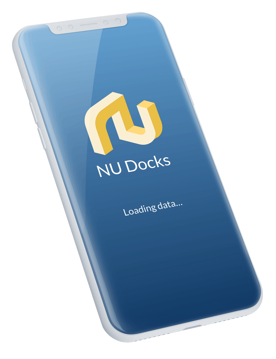
Dock Scheduling app

Here is an example of one of my recent challenge projects.
I will show you my design process.

Design Assignment

Feature Name
Dock Scheduling

Background

Contract packaging sites have loading docks where trucks arrive and staff can load outgoing shipments or unload inbound shipments. Only one truck can be at a dock, or a dock door, at any given time, so it is essential that docks are managed appropriately to avoid any conflicts. Shipping companies call in advance to make a dock appointment, or to change or cancel an existing appointment.
Today dock scheduling is managed most often in Excel. The client services team has heard feedback from customers that they would like to perform dock scheduling within our application so that they can manage all parts of the shipping and receiving workflow.

Objectives
Design the Dock Scheduling feature that will allow the Shipping/Receiving Clerk at any co-packing site to be able to manage their docks.

We need wireframe and/or low fidelity prototype to understand general direction and planning developers resources.


Here is a scheme of my design process.

Step 1
Research

Before to start I collecting the answers for the following questions:
What is this app for?
What information do we have?
What are our priorities?
How do users work?
How can I make the working process simpler, faster and more effective?
What information do they need/don't need?

This will help me understand how the process works and what functionality users need, and think about its' optimization and automatization.

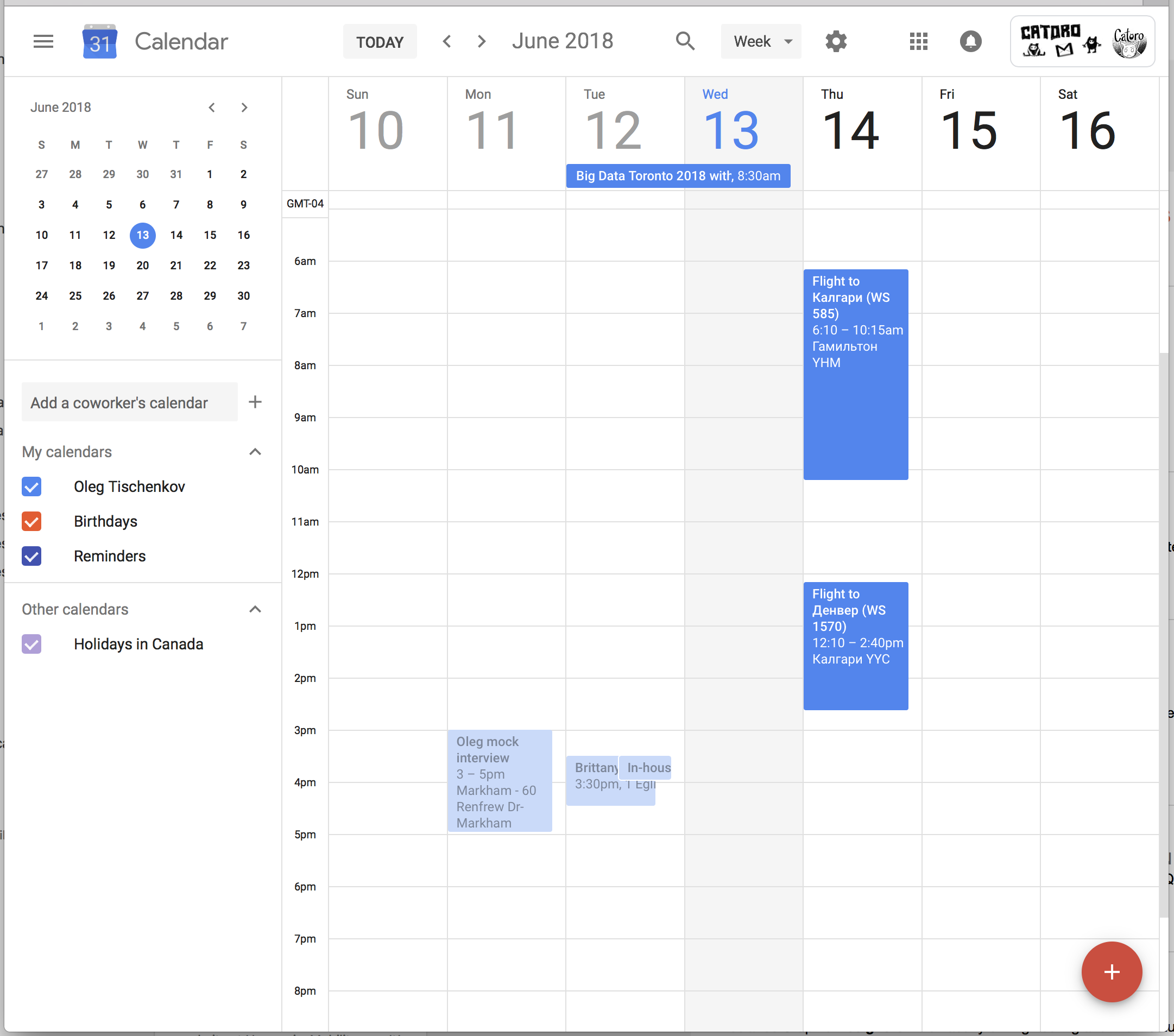
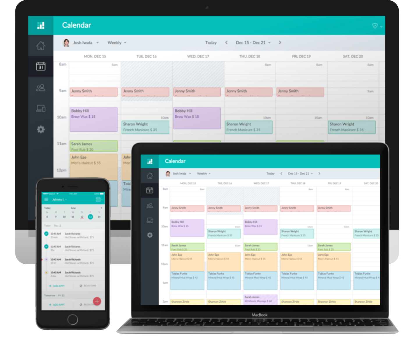
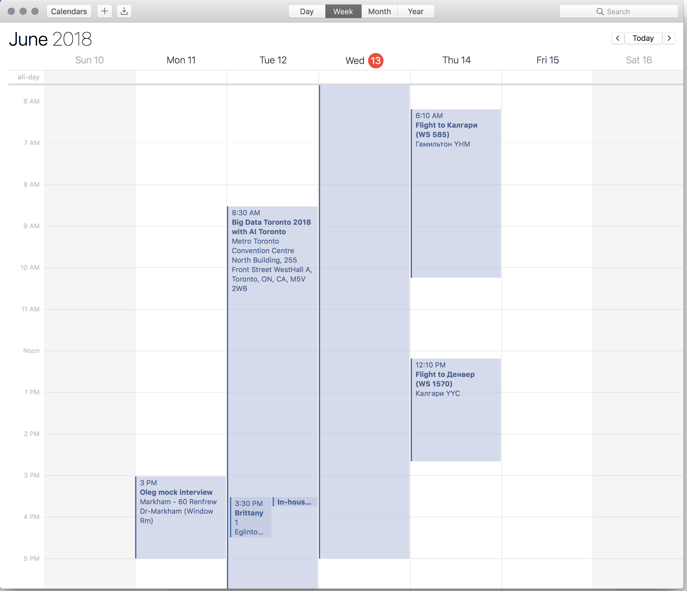
Then I started to research competitors and similar applications.

From my perspective a big part of this application will have the same functionality as day planning or meetings schedulin, plus some additional specific interactions.

Here you can see some examples of similar applications.

Step 2
Analyze.
Mind nodes.
Questions.

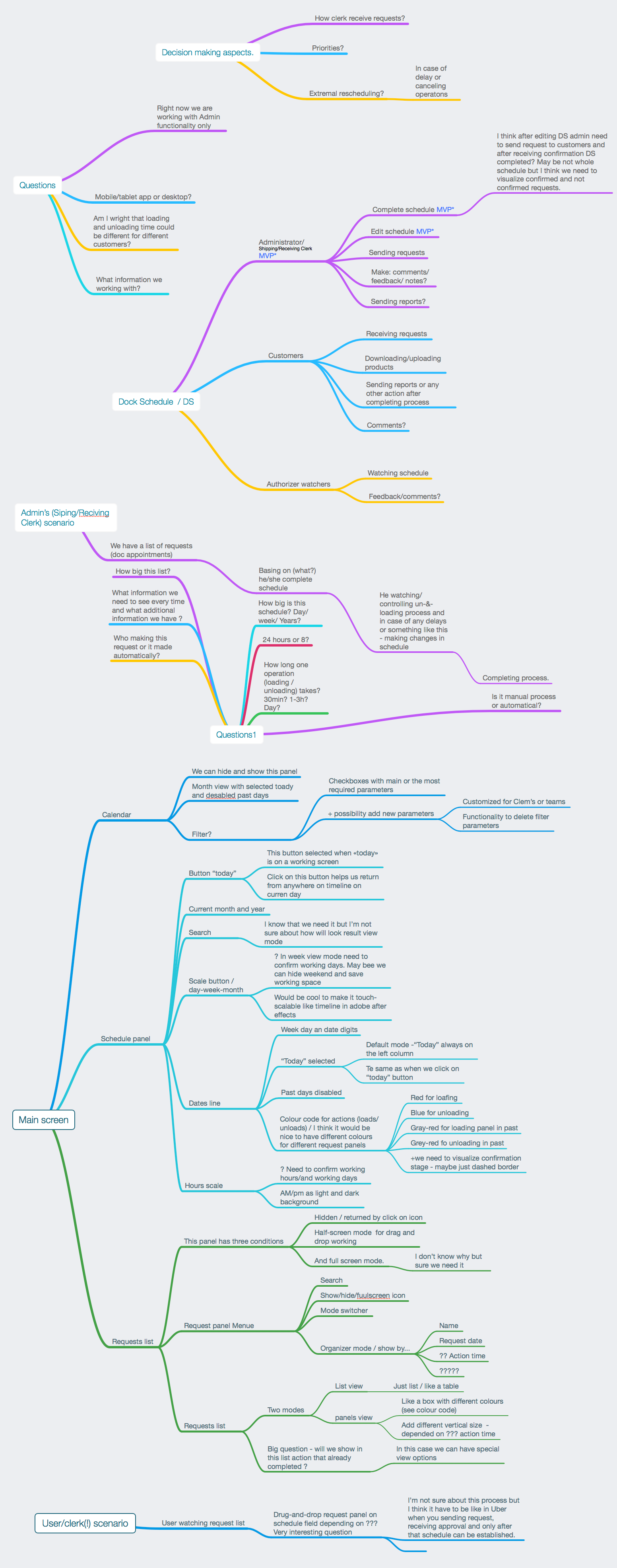
I made mind nodes to visualize that objectives and questions that I need to solve.

Here are some of my mid nodes that include:
- user scenarios
- user flows
- how Clercks work and what interactions they make
- information prioritets

I designed a screen structure and details, trying to focus on MVP and thinking about next step of improving this application, as well as adding some functionality that will help to let working with this application be more simple and effective.

These are additional mind nodes that helped me think about UX for this application.

Mind nodes set 1 (pdf)
Mind nodes set 2 (pdf)

Step 3
Wireframing

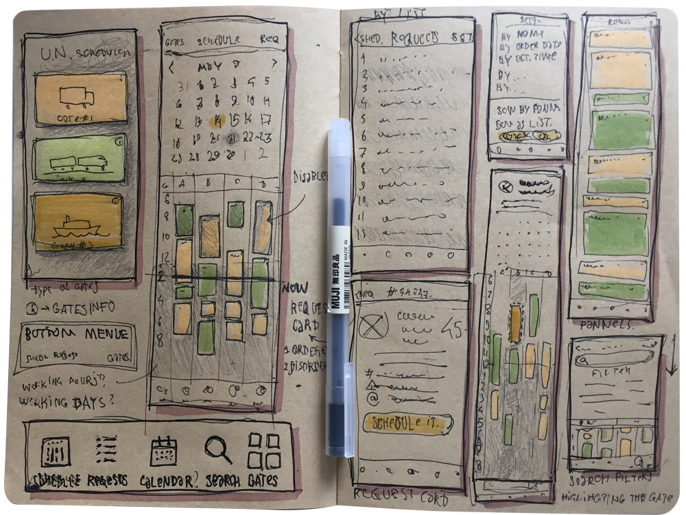
Pen & sketchbook are the best tools for making first view of the screens for uderstanding and visualizing user flow for all scenarios.

It helps to better understand composition and information architecture based on ideas and solutions from the previous step.

Step 4
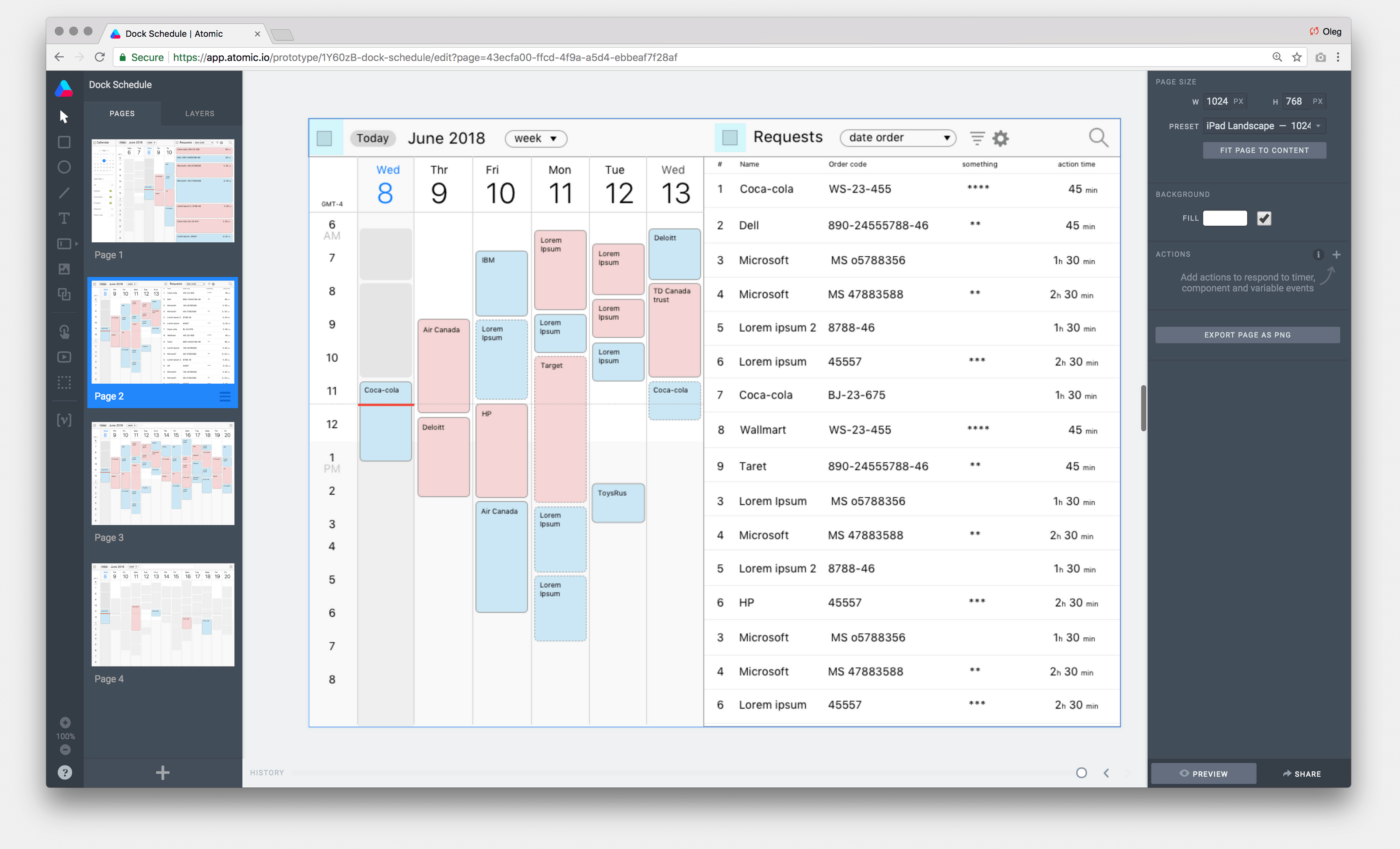
Prototyping

For a long time my main tools for prototyping was marvelapp and atomic. They are open-sourses web applications that allow sharing of results with clients.


But time changes.
Now My faforinte prototyping tool is Adobe XD.

However I working in InVision (+InVision Studio) Figma, Kite and Prinsiple
PS: And time to time trying to work in Balsamic.

Dock schedule app
See prototype 2 >>

Step 5
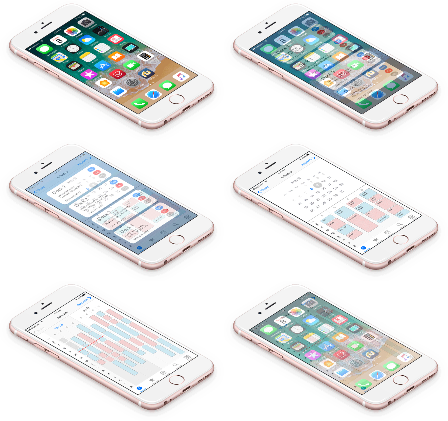
Mock up

I made a low fidelity mockup.
We tested it, collected comments from clerks and after that we discussed this prototype with the product owner and other involved coworkers.

Basing on these results we decided to make some critical changes in brief. But this work and my solutions were accepted as base for the final product.

Here I'm returning to step 2 and begin to study my questions in depth, continuing on updating the wireframes and all other steps while focussing on business needs and first of all the user convenience.


Fell free answer you questions by oleg@catoro.ca